
Configuration
Widget Settings
Configure widget behavior, appearance, and additional features.
Widget Settings control how each widget behaves, what information it displays, and how it reacts to specific states.
The settings window can be opened by right-clicking a widget placed in the layout preview or selecting the corresponding settings button from the Widget List.
The window header identifies the selected widget, its size, dashboard, and current screen. Settings are associated with that specific widget variant and size. For example, different sizes of the same widget may use separate configurations.
Available settings vary depending on the selected widget, but they are generally divided into three categories:
Behavior
Appearance
Override
Setting Scope
Each settings category displays a scope label indicating where its options are applied.
All Overlays means that the settings are shared by every overlay placement of the selected widget across all active screens of the current dashboard. For example, enabling Auto Show for the ABS 1×1 widget applies the same behavior wherever that widget is placed on the Overlay layer. These settings do not affect placements on the Main layer.
All Screens means that the settings are shared across every screen of the current dashboard. This scope is generally used for appearance and content options, ensuring that the widget keeps the same visual style and configuration wherever it is placed.
Current Screen means that the settings affect only the currently selected screen. The same widget can therefore use a different configuration on each screen. This scope is used for screen-specific options such as Override Mode.
Behavior
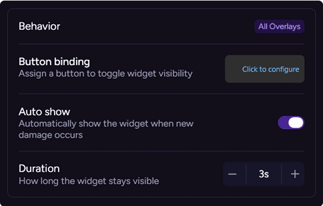
The Behavior section controls how an overlay widget is shown during a session. These settings only take effect when the widget is placed on the Overlay layer. Depending on the widget, the following options may be available:
Button Binding: Assigns a steering-wheel or keyboard control used to manually toggle the widget visibility. The assigned control affects every overlay placement of that widget within the current dashboard.
Auto Show: Automatically displays the widget when its associated event or condition occurs. The trigger depends on the selected widget. For example, a damage widget can appear when new damage is detected, while an ABS widget can appear when the ABS setting changes.
Duration: Sets how long the widget remains visible after an Auto Show event is triggered. When a duration is configured, the widget is automatically hidden after the selected amount of time. When duration is unavailable, its visibility remains linked to the corresponding trigger condition.
Appearance
The Appearance section controls the visual style and displayed content of the widget. Available options depend on the widget and may include:
Color customization.
Visual variants.
Lists used to choose which data is displayed.
Appearance settings use the All Screens scope. Changes are therefore applied to every placement of that widget across the current dashboard, keeping its presentation consistent between screens.

Override
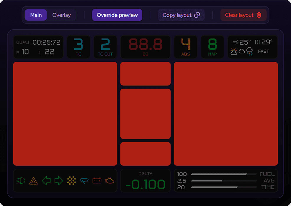
The Override section configures the widget for Override Mode. Override Mode uses selected widgets as modular visual alerts for important vehicle states, including ignition off, engine off and pit limiter on. These settings use the Current Screen scope and can be configured independently for each screen. This makes it possible to build a custom alert pattern based on the structure of each layout.
Visual Alerts enables Override Mode for the selected widget. When an override condition becomes active, widgets with Visual Alerts enabled remain highlighted and form the visible alert pattern.
Alerts Dimming makes the selected widget darker and less prominent when an override condition is active. This option is intended for widgets that are not part of the alert pattern, improving contrast and making active visual alerts easier to identify during a session.
By combining Visual Alerts and Alerts Dimming across multiple widgets, each screen can use its own clear and modular warning layout.
The Override Preview control in the toolbar lets you preview the configured alert pattern directly in the layout. Select an override condition to verify which widgets are highlighted or dimmed without starting a session.
Widget Settings control how each widget behaves, what information it displays, and how it reacts to specific states.
The settings window can be opened by right-clicking a widget placed in the layout preview or selecting the corresponding settings button from the Widget List.
The window header identifies the selected widget, its size, dashboard, and current screen. Settings are associated with that specific widget variant and size. For example, different sizes of the same widget may use separate configurations.
Available settings vary depending on the selected widget, but they are generally divided into three categories:
Behavior
Appearance
Override
Setting Scope
Each settings category displays a scope label indicating where its options are applied.
All Overlays means that the settings are shared by every overlay placement of the selected widget across all active screens of the current dashboard. For example, enabling Auto Show for the ABS 1×1 widget applies the same behavior wherever that widget is placed on the Overlay layer. These settings do not affect placements on the Main layer.
All Screens means that the settings are shared across every screen of the current dashboard. This scope is generally used for appearance and content options, ensuring that the widget keeps the same visual style and configuration wherever it is placed.
Current Screen means that the settings affect only the currently selected screen. The same widget can therefore use a different configuration on each screen. This scope is used for screen-specific options such as Override Mode.
Behavior
The Behavior section controls how an overlay widget is shown during a session. These settings only take effect when the widget is placed on the Overlay layer. Depending on the widget, the following options may be available:
Button Binding: Assigns a steering-wheel or keyboard control used to manually toggle the widget visibility. The assigned control affects every overlay placement of that widget within the current dashboard.
Auto Show: Automatically displays the widget when its associated event or condition occurs. The trigger depends on the selected widget. For example, a damage widget can appear when new damage is detected, while an ABS widget can appear when the ABS setting changes.
Duration: Sets how long the widget remains visible after an Auto Show event is triggered. When a duration is configured, the widget is automatically hidden after the selected amount of time. When duration is unavailable, its visibility remains linked to the corresponding trigger condition.
Appearance
The Appearance section controls the visual style and displayed content of the widget. Available options depend on the widget and may include:
Color customization.
Visual variants.
Lists used to choose which data is displayed.
Appearance settings use the All Screens scope. Changes are therefore applied to every placement of that widget across the current dashboard, keeping its presentation consistent between screens.
Override
The Override section configures the widget for Override Mode. Override Mode uses selected widgets as modular visual alerts for important vehicle states, including ignition off, engine off and pit limiter on. These settings use the Current Screen scope and can be configured independently for each screen. This makes it possible to build a custom alert pattern based on the structure of each layout.
Visual Alerts enables Override Mode for the selected widget. When an override condition becomes active, widgets with Visual Alerts enabled remain highlighted and form the visible alert pattern.
Alerts Dimming makes the selected widget darker and less prominent when an override condition is active. This option is intended for widgets that are not part of the alert pattern, improving contrast and making active visual alerts easier to identify during a session.
By combining Visual Alerts and Alerts Dimming across multiple widgets, each screen can use its own clear and modular warning layout.
The Override Preview control in the toolbar lets you preview the configured alert pattern directly in the layout. Select an override condition to verify which widgets are highlighted or dimmed without starting a session.
Any other questions? Get in touch